
In the healthcare industry, where the products go through rigorous tests to prove that they are safe and effective, it is not surprising that many healthcare manufacturers insist on putting their logo designs through the same vetting process. “First do no harm” is not just the physician’s credo, but also the mantra of healthcare marketers. Whereas consumer product companies challenge their agencies to deliver greatness and innovation, more often than not, healthcare goods and services companies demand a more conservative standard: don’t screw it up.
But can logos really be tested? The simple answer is yes. However, it comes with this caveat: don’t expect too much from the research. If proper and reasonable methodologies are used, some clear gross positives and negatives will emerge. For the sake of clarity, here’s a glossary of terms used in this post:
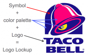 Logos—or Brandmarks, as designers call them—come in several different forms. For example, a logo lock lockup without a symbol is called a Wordmark. And many consumer logos have the logo contained inside a shape. But most regulated healthcare logos follow the conservative formula outlined above: the logo (brand name rendered in type), a symbol (located to the left, right or above the logo), and a color palette (a set of primary and accent colors). With a simple glossary in place, let’s take a look at some key learning’s and best practices when testing logos.
By their very simple nature, logo lockups can only communicate so much
Overtly representational symbols constitute claims, which the regulatory authorities will not allow, so symbols are fairly abstract (i.e. relatively meaningless). Name, typeface, color and symbol must work together to suggest an impression rather than make an overt statement.
Healthcare professionals (HCPs) have no frame of reference to make absolute judgments about what they are looking at
HCPs have not used the brand yet, nor been exposed to any marketing for it. Under this circumstance, they will A) reach for surrogate experiences to make their judgments (e.g. “reminds me of that shampoo logo”), and/or B) prefer more representative symbols simply because they are trying to create the functional relationship they lack at present (e.g. “I like the “>” sign because it means you get more; that other swoopy thing means nothing to me”).
HCPs have no talent or vocabulary for evaluating visual information
Logo research should never give much credit to the opinion of people who not only lack the skills to discuss minute details about visuals and color, but also feel uncomfortable when tested. This is not intended as a put down of HCPs. They are extremely talented at what they do: diagnosing illness and providing the appropriate care. However, their many years of education do not train them to be marketers or graphic critics. Further, HCPs are career trained to search for pathology. Their job is not to miss ‘something wrong.’ They will often trivialize or criticize the logo lockups because they feel intellectually vulnerable, and suspect that if they like something without criticizing it, they may be failing a test of their diagnostic acumen.
Never take what HCPs will see out of its intended context
There is a bad practice making the rounds where clients are encouraged to test elements of the logo lockup individually. Why? What is to be learned? Test them first in black and white to see what they communicate without color? Test the logo and symbols separately to see how to combine the most well-liked symbol with the most well-liked logo? These kind of suggestions prey upon the worse fears of healthcare clients. Remember “don’t screw it up?” Fear-mongering ideas such as these make clients feel that unless they put their logos through every test possible, they are going to miss something and have a horrible outcome. Nonsense. No one will ever see the logo as anything but what it is: a combination of letter shapes, symbol and color, suggesting aspects of the brand personality and maybe, maybe, the brand promise. These elements work together, not alone, and will only gain meaning through experiences customers eventually have with the brand itself. Anyone who suggests over-testing such limited visual information is looking out for their own profit margins at the expense of good judgment.
So what can research reveal?
As I indicated before, research can assess gross positive and negative reactions that point to how a logo lockup might be refined to achieve its objectives. These are A) how well the logo lockup aligns with the Brand Personality Traits: does it elicit the feelings intended, whether it be Reassuring, Straightforward, Uplifting or any other intended suggestion. Sometimes (depending on how representational the symbol is) research can capture the association of functional and practical benefits with the brand. That is, what the brand treats, how often it is dosed, an aspect of how the brand works to achieve its effect, and so on.
And what can’t it reveal?
As much as it would be desirable, research cannot ‘pick a winner.’ For the very reasons stated above—lack of context, and lack of skills on the part of HCPs to critique visual shapes and colors—marketers must make decisions based on their own knowledge of the brand’s potential, as well as on the intended marketing experience that they will field as the brand launches. The methodology will determine success or a waste of money, so make sure to work with a branding company that has done this before, and can show you the right path to getting the best, most reasonable answers possible.