
Well, the 2020 election prep is heating up, with Trump eying another run and over 50 Democrats announcing their candidacies—OK, maybe not that many, but it sure seems so. And each has developed a logo that helps create the identity they wish to project. Like a flag, a logo makes a statement about the values behind the colors, shapes and letters. And also like a flag, it doesn’t steal much attention from the real star—the person it is representing. The color schemes are predictable, and the typography pretty bland, but let’s take a look anyway at what the candidates’ logos do and don’t say about them.
I can do anything you can do better
Trump may not like much about Obama, but when it comes to logo design, the two are on the same page. 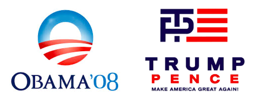 Obama’s thoughtfully rendered logo is the only one in the past decade that shows some sense of good design. It also helps that number 44’s name begins with an “O”—a letter shape that in itself constitutes harmony and optimism. Trump gives it a good try with the “T” and “P” (for Trump and Pence) forming the blue field of the American flag. Of course, Trump goes Obama one step better with his signature phrase: Make American Great Again! Whatever you think about president number 45, no one can deny that he does know a thing or two about branding. But those are logos of the past. Today’s logos bear examination now, while the mood is still fresh and new.
Getting graphic
Speaking of some good attempts at graphic design, two relatively unknown candidates may be trying to get known by their style. 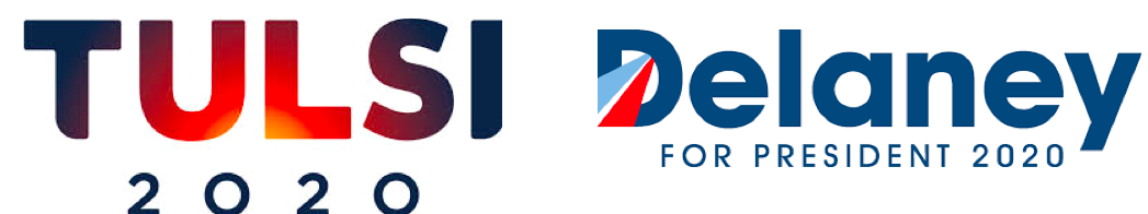 Check out Tulsi Gabbard’s funky typeface, where the bottoms of the “T” and “I” are rounded off. This congresswoman from Hawaii—the first American Samoan and first Hindu representative—shows off the Aloha state with a gradation from below of a fiery red, as if the sun were rising on her name. With a nod toward Obama, John Delaney, a former congressman from Maryland, has a logo that features a crisp typeface (check out the “e”s) and an American pathway to the future running right through the “D” in his name. What he lacks in pizzazz, he makes up for in graphic chops.
What it says about them: Hey, I’m over here, just waiting for you.
What it doesn’t: How far from center stage will I be for the debates?
Hello my name is…
We have some of the candidates preferring to feature their first names, echoing what became the disastrous effort for Jeb Bush.  The exclamation point was intended to represent a rah-rah spirit, with the passionate red attempted to inject some spiciness into his personality (after all, Jeb speaks Spanish). But the man just couldn’t live up to the logo. Still Klobuchar and Sanders are confident in the strengths of their first names. And Klobuchar offers a refreshing green to her color palette, signaling a new beginning (think Spring).
What it says about them: We’re nice, relatable people with whom you could share an elevator ride without the typical awkwardness.
What it doesn’t: If I get into office, I’m still insisting on everyone calling me Mister/Madam President.
Salute when you say that, soldier!
If using one’s first name doesn’t work for some, then totally rely on one’s last name. Gillibrand and Warren project an all-business attitude. Also, they don’t have friendly first names. Elizabeth is what your grandmother might have been called. And Kirsten sounds like an ice-princess from one of those northern European countries. As a bonus, however, it doesn’t hurt that Gillibrand actually has the term “brand” in it.
What it says about them: We can play this male power game.
What it doesn’t: Don’t invite me to your holiday party; I’m too busy.
In your face, mister.
If you thought Warren and Gillibrand were forthcoming, then stay out of the way of Cory Booker and Julian Castro. 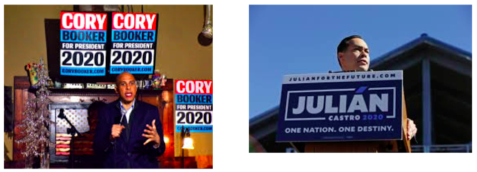 These are candidates that are possessed by the issues and by themselves. Booker always seems like he’s about to run into a burning building (wait, he actually did that!) and Castro dares you to be holier than thou with his tag line, “One nation. One destiny.” Both should join forces with the Avengers.
What it says about them: Don’t mess with me; I’m on a mission.
What it doesn’t: I need to try some decaf.
What’s my Yelp rating?
When it comes to Kamala Harris and Pete Buttigieg, the stars are out tonight. First, who the hell is Pete Buttigieg? For those like me who had to Google him, he’s the Mayor of South Bend, Indiana, a war veteran, a Harvard graduate and the first openly gay candidate for president. 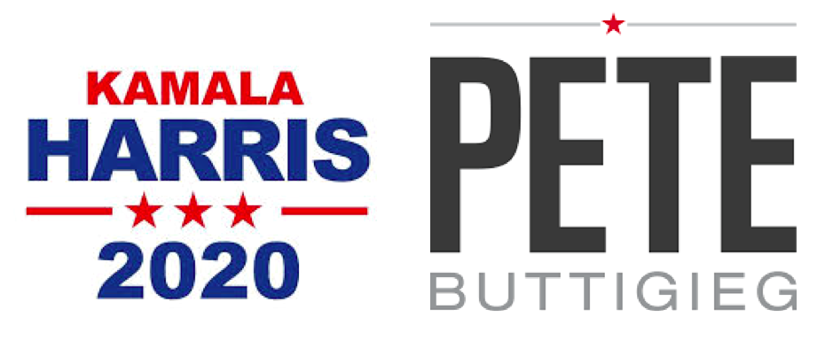 Sounds impressive. So what’s with the black and gray type? Could you get anymore bland? And when it comes to your own self-opinion, you give yourself a rating of one star perched above your name. On the other hand, Kamala Harris earns three stars. Both logos are big and bold, a statement about their aspirations.
What is says about them: We’re really important. No, really.
What it doesn’t: We’re the ones who aren’t Amy and Bernie.
When it comes to whoever gets the nomination, some things never change about presidential logos: they are wrapped in the American flag, their typography is easily found in the drop-down menu of anyone’s computer, and ironically, they desperately seek to look like something resembling a change from the status quo. May the classiest logo win