
It’s been an uneven year in healthcare branding. Some bad trends continue, while others have found a way to connect with patients and physicians. Without further ado, here are the best and worst healthcare branding efforts of 2018.
Best Brand Story: Chantix
Chantix uses a tried and true methodology to present its brand story: patient testimonials. This prescription therapy for smoking cessation has reached a new high with a celebrity endorsement from Ray Liotta, that menacing actor from top films. Liotta plays against type as he reveals his vulnerability to nicotine addiction and his triumph enabled by Chantix. While Liotta’s measured speech is very believable, there are times when he sounds stoned. All in all, a successful effort.
Worst Brand Story: Prevagen
This over-the-counter brand starts off strong but then veers into a bizarre narrative about its origins.The brand does a good job of presenting itself as another supplement one can take to improve the symptoms of old age: memory loss. Its tag line is a groaner: The name to remember. But even worse, its main ingredient was “originally discovered in jelly fish.” Nothing says scientific breakthrough for memory than a creature without a brain, especially one whose sting keeps people out of the ocean. Remember to forget it.
Best logo: Dupixent
This new brand for eczema (atopic dermatitis) presents a logo that is dynamic and optimistic. The name in a flannel gray is beautifully offset by the colorful icon showing progress in a transition from hot colors to cool ones. 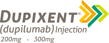 The proprietary italic type fits like a lock and key with the icon for a result that is responsible and uplifting. Just like good branding should be.
Worst logo: Xeljanz XR
From it’s indistinctive type font and black color to an icon that is inscrutable, Xeljanx XR limps to the finish line with the worst logo of 2018. The icon, rendered in an inflammatory red—an odd choice for an arthritis drug—features what appear to be a series of pins arranged in a circle. Is this supposed to brand the problem (your fingers feel like they have needles in them)? 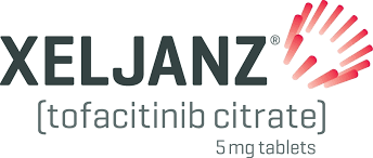 If so, it breaks the cardinal rule of logos: never make the problem more exciting than the solution.
Best Mascot: Mucinex
The fat green glob of mucus we love to hate has grown on us over time. Maybe it’s the hat, or the green plaid pants held up by suspenders, Mr. Mucus is instantly recognizable as Mucinex’s property. When it comes to the sticky mess that accompanies head and chest colds, Mr. Mucus does a more than decent job of making us fond of the character and fond of the brand.
Worst Mascot: Viberzi
It’s the walking, talking human bowel everybody! You’ve seen her: a redhead who looks remarkably like Kathy Griffin on a bad day. Dressed in a flesh-colored body suit with an illustrationof the intestines imprinted on it, this mascot is seen stalking a patient with abdominal pain and diarrhea.  What’s the message being sent? That the drug is silly and cartoonish? Not a good look and feel. Yet one cannot look away—just like viewing a bad car wreck. Diarrhea isn’t funny.
Best visual style: Keytruda
The black and white rendering is a bold move in the land of full-color prescription drugs. In addition to being visually distinctive, the gray tones of the background make for an ideal contrast to the grass-green Keytruda color. The visuals also show something that other brands fail to show: people going to work and doing daily chores—not painting on the beach, not flying a kite, and not dancing for no reason. It’s very compelling to see real reality for once.
Worst visual style: Opdivo
You’ve seen it: the giant letters projected onto the sides of buildings as people look up in awe, like newborns staring at a ceiling fan. What looks like the second coming of Jesus turns out to be a plug for a very good drug with bad cosmetics. On a side note, it has one of the most ridiculous calls to action I’ve ever heard: “For adults with advanced small-cell lung cancer, previously treated with platinum-based therapies, including those with an abnormal EGFR chain.” How do they expect patients to self-identify?
Best typography: Farxiga
This ultra-contemporary font with its all lower-case letters and off-kilter curves (check out the a’s and the g) easily wins for best typography. Very imaginative while remaining responsible. The one problem: no one can pronounce the name. 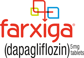 The latest TV commercial says, “Ask your doctor for the drug that begins with f.” No kidding. They’ve just realized the pronunciation issue? Where’s the market research agency that missed this one?
Worst icon: Farxiga
If you loved the typography, you’ll scratch your head over the symbol, which sits over the drug name like a direct TV satellite dish. What’s going on here? Follow the red line until you are out of the maze? This jug-handle traffic sign is a good exampleof an over-designed logo. Let the typography do the work without messing things up.
Wishing you the best in life and in branding. Happy Holidays everybody.