
While giving a talk promoting my forthcoming book—specifically decrying the use of consumer branding protocols to create healthcare product and service identities—I received a thoughtful question from the audience that deserves a good answer: Isn’t there anything to be gleaned from consumer brands that could be co-opted to help deliver a truer brand experience for healthcare brands? I gave a long answer at the talk. The short answer is: yes, from liquor and cosmetic brands.
The long answer begins with a clarification—also from the book—that while consumer branding protocols in customer insight mining and brand strategy development are likely disastrous for healthcare brands, there are many lessons to be learned from consumer design principles in presenting the visual assets of an identity. To develop that perfect amalgam of thoughtful, simple and telegraphic design, I source talent specifically from the world of consumer branding and then work to imbue them with the discipline needed for the healthcare market: polishing the spiky edges of exuberance to find the rare middle ground between visually saying everything and saying nothing at the same time. I’m being serious, here. In a market so regulated as healthcare, where visuals and phrases can likely state claims (pinging the FDA’s radar and warranting lengthy fair balance language), design can be the make-or-break factor to communicate the brand promise and personality forcefully, yet tacitly enough to color within the lines.
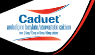
Take the example to the left. The practice of graphically highlighting multiple agents combined in a single dosing form is quite common in healthcare logo design as fixed-dose combination drugs become more prevalent. However, you will see in the Caduet logo, the mouthful of generic and information—centered, to boot—compels the two red symbols above and below the logo and generic type to digest it like a giant set of lips chomping down on all the typography. The icon itself, conscripted to tell a “combination” story breaks into two parts rather than one integrated whole, thereby leaving the original strategic intent of “two-in-one” unfulfilled. This is a typical healthcare example where design is being shoehorned into a strategy that may be vitally important to the marketers at the expense of being incommunicative to customers.
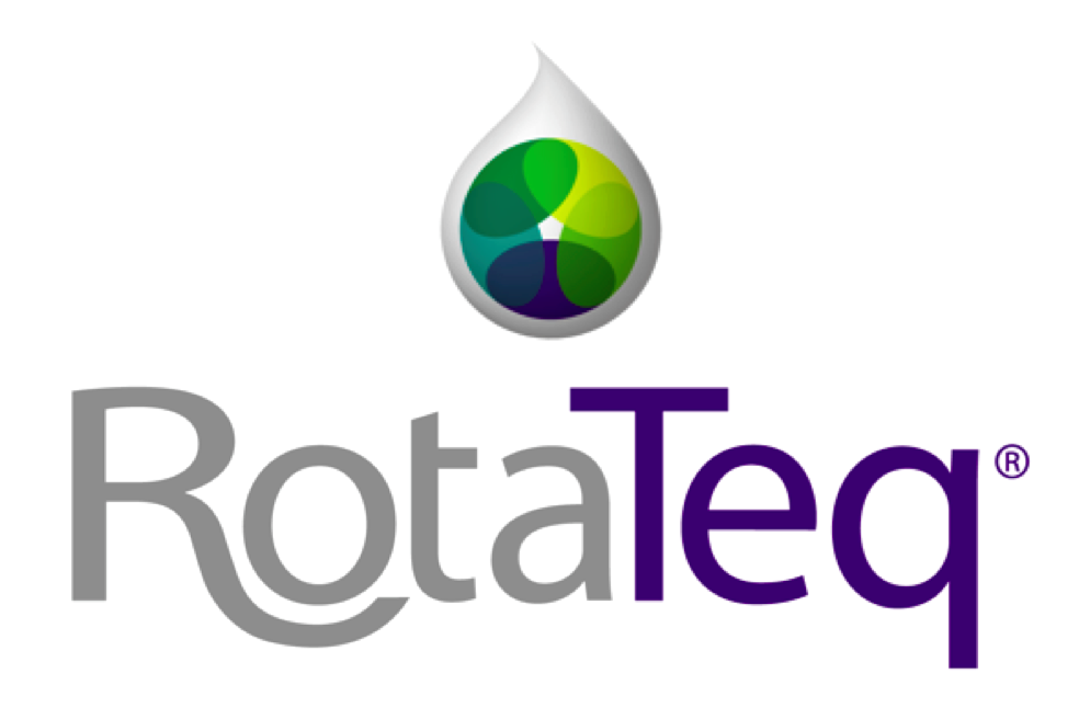
On the other hand (immediately left), the principles of esthetic nuance culled from a consumer branding designer manage to capture a five-ingredient vaccine for RotaTeq in one elegant icon, where a single liquid “drop” (it’s an oral, liquid vaccine) contains five integrated colors—a triumph achieved using consumer-branding skills. But enough about drugs. Let’s get to the booze and beauty.
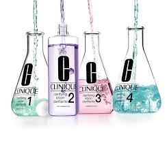
It might seem sacrilegious (or at the very least, silly) to suggest that healthcare branding design can learn from the liquor and cosmetics industry. However, these categories have something essentially in common with prescription drugs and medical devices: they are all governmentally regulated entities. And as such, they cannot come right out and tell their brand stories; they must show them or else run the risk of a wrist-slap from the ATF or FDA respectively. Healthcare brands are always trying too hard to put forth a brand narrative that by its very nature resists elaborate articulation on the page. Look at the two examples below, and how each is trying to convey the idea of a brand narrative about the unique pathway a product takes to get its job done.

 On the top left we see an ad for Requip (ropinirole), a dopamine-agonist used to treat Parkinson’s Disease and Restless Leg Syndrome. In a nutshell, one of the problems with dopamine agonism is that, over time, there is a “poop out” effect; the receptor site in the brain gets exhausted and becomes indifferent to the drug. Requip’s identity is all about avoiding such an effect because of its formulation. Look how over-wrought the narrative becomes as we scan the page: the metaphor of a dove emerging from a cage is not clear enough, apparently, as the marketing team insists on having the headline also state the exact same metaphor: “The potential of dopamine agonist therapy is released.” The concept of “release” refers both to the dispersion and uptake of the drug as well as the emancipation of the patient from his/her symptoms. However, the personality trait of “elegance” attempted by the image of a dove is defeated by the inelegance of the clunky narrative. The idea of a “released potential” looks cooped up as the design floods the page with visual and verbal information, leaving the viewer gasping for air.
On the above image to the right, we see how a cosmetics brand handles a similar situation. Without a single word on the page acting as a headline or body copy, and with the visual cues of Erlenmeyer flasks—signaling that they have unwavering confidence in the science behind their brand—combined with the vague pastel liquid contents—signifying elegance and reassurance, Clinique has communicated volumes about its brand promise and personality without putting it into a novel on the page. There’s nothing for the FDA to evaluate. In short: less is more. And more lessons from consumer design principles will result in less awkward brand identities in healthcare.
While my book goes on to eschew the consumer practice of “brand as hero” for healthcare brands (hint: healthcare isn’t about the brand but rather how the brand protects the customer’s public-facing identity from behind the scenes), a real lesson can be adapted to build on the less-is-more principles seen in design for alcoholic spirits. Take the example below for Suntory whiskey.
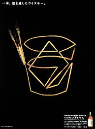
Suntory’s brand identity rests on its long heritage and its Japanese spirit that stands for pride, purity and a classic drinking experience. With the efficiency and artistry of a Japanese word character, we see a straw-colored strand of wheat (from which the beverage is distilled) folded origami-style into the shape of a tumbler filled with ice and whiskey. The brand says it embodies the essence of a refined sense of living and social status without saying much at all. In fact, if the ad—like many healthcare ads—tried to articulate this narrative, the narrative would collapse by becoming the opposite of elegant, prideful and refined; it would be seen as bragging, self-congratulatory and over-engineered.
I know what you’re thinking: healthcare brand identities must communicate much more complicated stories than whiskey. True. But the art is in communicating complexity via simplicity, which on the surface seems like a Catch-22. Let’s take a very subjective topic that’s ubiquitous in healthcare—pain. Witness this ad for Lyrica (pregabalin), which attempts an opera about neuropathic pain.
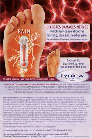
If you quickly gaze at the ad, the brand identity comes off as Lyrica = pain. What can we learn from the less is more protocols of consumer design for alcohol, which aside from describing itself, cannot make any real claims about its benefits (guaranteed to get you soused)? Here’s a wonderfully branded ad from Finlandia vodka.
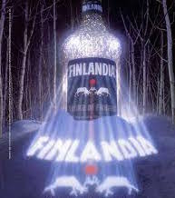 What are the brand promise and personality? The divine light emerging through the bottle suggests an experience of monumental significance, a transcendent level of drinking pleasure. The cold, woodland setting certainly conjures a frosty treat, but also an eerie sense of danger and allure, illuminated for your security by the brand itself. But the primary take away is the brand is actually a destination—a place to which one can go and be at peace with a high-quality buzz. Again, I can hear you saying: but Vince, what does this have to do with pain? And your book argues mightily against the “brand as hero” consumer approach. What gives? Great questions. What inevitably healthcare brands feature when trying to associate themselves with the pain category is the pain itself. Grimacing people clutching at their joints. Why not try and own the opposite of pain, or relief? Most companies struggle showing the “absence of pain” as we can see in this 1990s ad for Vioxx.
 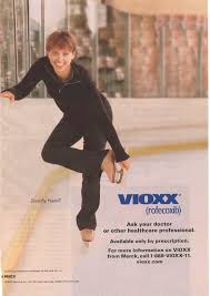 Here, relief is personified by the gold-medal skater, Dorothy Hamill, pictured about 15 years after her Olympic victory, and no doubt experiencing some middle-aged joint pain. Despite her equity at the time as the most admired sports icon of her era, her “lack of pain” doesn’t translate the brand promise of relief very well for Vioxx. The visual communicates success and happiness. And research at the time revealed that people don’t believe that celebrities have real pain, especially younger, smiling ones. However, taking a lesson from Finlandia, my team and I devised a way to make the concept of relief as a branded value for Vioxx work (see immediately below).

This is not “brand as hero” but rather “patient benefit as hero.” Unfortunately this idea was left on the cutting room floor in favor of another branded idea called “A new world of relief” (below left), which helped make the Vioxx brand an instant blockbuster.
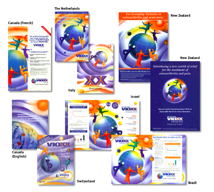 Sadly, Vioxx was taken off the market a few years after launch because its use in the general population became associated with cardiac events. Still, it serves as a good example of how healthcare branding can avail itself of the visual identity protocols associated with other regulated categories, such as liquor and cosmetics, where the less one explains, the more one reveals. It’s the difference between telling and showing.
if only our clients would have the guts to take more risks! make the leap – be an example for the rest of the category
On the other hand, wouldn’t you argue the spirit and cosmetic industries are by nature more sophisticated? Targeting beyond the aspirational and promising more then just “feel better” or “relief”. Spirits take you places, provides fun, entertainment, a life style, status… a secondary state of mind… Cosmetics promise improvements, miraculous transformations… a new face… all of it is nearly/closely selling the “surreal!” …. could drugs do that?!
or would be it be entirely turned down by the FDA and investors ….
…maybe sometimes it’s riskier not to take a risk. Sometimes all you’re guaranteeing is that things will stay the same.
This is a great article Vince. In our work we bear witness and suffer the consequences of a lack of true understanding of branding and the power of brand design and design thinking to elevate healthcare brands. There are so many challenges to achieve work that is powerful evocative and sparse it is almost impossible to nail them all down.
I will suggest that not all art directors are great designers. And not all designers are great art directors. Agencies in large measure do not understand the difference of these skills and very often lump them together to sad results.
At my former agency, Palio, we built a dedicated design discipline distinct from art direction. It made a huge difference in the quality and appearance of our work — it made our work, work harder and helped it achieve great results for our clients.
On the client side, all too often the marketing team’s efforts to deliver a very strong, well conceived and designed brand are undermined by too many cooks in the kitchen. Sales is not marketing and marketing is not simply advertising. That said, design should be the common denominator that unifies these often disparate points of view. Design should be seen as the champion rather than the after thought. As an after thought, design becomes the opposite of elegance and refinement of thought and execution, it becomes a series of compromises.
You raise many great points in what we can learn from consumer brands. I hope my comments are supportive. My new agency Brandforming is a design driven organization.
– Cheers to booze and beauty!