There’s a natural human desire to reduce the mysteries of life down to an exact science. After all, such rigor can replace one’s natural courage and judgment with a proven methodology for sorting out uncertainties. As David Letterman’s classic comedy bit illustrates, we have an addiction to rank unrankable things into a top 10 version of the “truth.” Nowhere is such a need more manifest than in the testing of logos, especially in fields that are risk averse, for example, healthcare. While logo testing is the search for exactitude in the face of the odds posed by judging winners and losers, there are some key dos and don’ts that can make the experience as good as it possibly can be.
DO test logos as your audiences consume them in everyday life
Unless you are in the graphic design, marketing or advertising business, or are an astute observer of the visual arts, you will never think about a logo as anything other than a subconscious reminder of your purchase habits. This is not a bad thing, as logos do function like a flag under which march loyal consumers of your brand. However, such a simple-minded attraction to logos denies the viewer of a logo’s natural place in the environments in which they really exist. When testing logos, test them in the ways customers are used to seeing them. Put them on a baseball cap or a shopping bag or in the context of a dummy ad—or all three if you wish to get a fuller perspective.
DON’T test logos outside of their natural context
Logos by themselves are in many ways empty vessels. That is, they can put forth a simple meaning, but that meaning is quite varied depending on the scenario. Very rarely will a logo be asked to stand on its own from the get-go. Such accompanying elements that help fully deliver on the brand’s intent are many different promotional vehicles like ads, TV spots, online venues and exhibit materials. These promotional vehicles shout out the brand’s values with megaphone intensity, with the logo summing up the story in its own proprietary way. Without such amplified volume, a logo is just another piece of commercial art in search of concrete meaning. So testing logos by themselves may seem like a good recommendation from research companies, but this process is actually counter intuitive to the way logos are perceived in the real world.
DO test your logos in a competitive background
Quite often, especially on the shelf of a store, your logo will be seen along with every other category brand. Or, for example, in medical journals, your logo will exist with other prescription brand logos as you page through. That’s why it’s important to always test your logo as it differentiates from other logos not only in its immediate competitive framework, but also in its extended framework in adjacent categories.
 Here we see a collection of logos in the medical marijuana category, where Allayent, by Parry Branding Group, clearly differentiates from the pack. Further, medical marijuana is also considered in the fields of pain, epilepsy and cancer. So also test your brand in the extended framework of logos in these categories.
DON’T use the same methodologies for logo testing as you do for testing other things.
Many research companies have set ways of measuring the qualitative and quantitative values of things such as ad recall, unsolicited recognition of an ad with a brand, and even stopping power of an ad—the total time spent by research participants looking at an ad. Notice I never once mentioned the word logo? That’s because most research firms use these same methodologies for logo testing even though they are wrong-headed. To understand the proper testing methods, one must start with defining the role of the logo. For most products, especially consumer goods, the logo functions as one element in packaging. A complementary color palette, and symbols or icons apart from the logo (such as holding shapes and other demarcations for information) are all competing for customers’ attention.

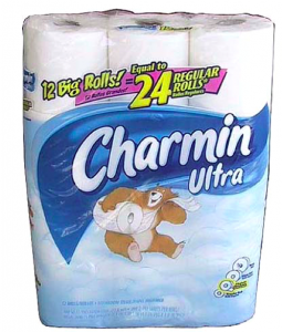
Take a look at the packaging for Charmin Ultra. Here a mascot—the cartoon bear—attempts to steal the show, while the logo must also vie for attention with the cloud-filled backdrop, the promotional copy advertising “12 big rolls = to 24 regular roles,” and the addition of a purple-colored swoosh. If this is the case with your planned logo, test it for how well it integrates with a variety of situations. If your logo functions as a central messenger, as does the Apple mark, then it should be tested for how much meaning and values it can communicate across the entire product line. These are two extremes, but you get the point.
DO test your logos for brand appropriateness
Your logo may adhere very well to the above-mentioned best practices: it works when shown on objects like caps and bags; it works when tested in the context of how it is viewed in the real world; and it works in competitive backgrounds.  However, if you have a brand of cereal, say, you don’t want it to look anything like, say, a feminine hygiene brand. So testing for category appropriateness is of paramount importance as well. If your brand is new to the market, use a product/service profile—a one-page descriptor of the product/service, and then test to see the relative appropriateness of your logo for its intended purpose.
Follow these proven best practices and you will get a very clear picture about which of the many logo ideas your are testing is right for your brand.
