The most common error when creating a visual brand identity is to treat it as if it were a commodity and pay for it as such. Beware designers or agencies that give you a rock bottom fixed price or charge design by the hour: they are accounting for their short-term profits rather than your long-term investment. And a logo is not an investment that you want to make without expert advice at fair market prices. That’s because you are not buying your company or product name in an existing typeface with some color and swooshes; you are buying a symbol that transfers enthusiasm to your customers for your goods or services. Here are five reasons why dirt-cheap logos will cost you more than a good one right from the start.
- If you hire the D students, you’ll never get A+ results: cheap logos are cheap for a reason. First, a low-priced designer will likely give you a few logos from which to choose without ever showing you what your competition is doing, and why the logos they are providing will set you apart. Before pen ever gets put to paper, your brand deserves to check out the company it will keep.
 We call this a Brandscape analysis: a deconstruction of the visual identities against which you are competing. How do you know if you are getting the right design without a competitive yardstick against which to measure? Cheap designers usually either skip this process altogether, or worse don’t know about it in the first place. If you don’t stand out from your competition, you may as well have not spent the money in the first place no matter how inexpensive.
 - Cheap logos guarantee you’ll never be able to charge premium prices: A cheap designer will likely give you a generic logo type face that you could have generated yourself by scrolling through the choices at the top of your Microsoft Word menu (just click on Font to see what I mean). A generic font is guaranteed to look generic—and your brand deserves a typography treatment that shouts a truly special experience only your brand can provide.
 Off-the-rack clothing makes you look like everyone else. Your brand deserves a custom-designed type font most cheap designers don’t know how to produce. Believe me, your customers will see “cheap” and run to one of your competitors that better reflects their desire to consort with more high-quality brands. That’s right: you’ll never be able to charge premium prices if you don’t show that you have a premium-designed brand logo yourself. Value begets value.
 - Cheap logos won’t fit every circumstance you’ll encounter: Where will your logo need to appear? In a square space? A horizontal space? A vertical space? The answer is “all of the above.” A logo is a combination of letters and/or symbols arranged in a fixed size relationship to each other called a “lockup.” If you are not getting a logo with all the lock ups you need, then you are heading for a fall when your logo suddenly won’t fit into an online venue or on a promotional item (think pens or caps) and you’ll have to spring for more cash to correct the problem.
 You should be getting logos in different lock ups, with authorized color backgrounds, in black and white and color, and with recommendations for proper clear space and minimum size. How cheap is a logo if you’ll only end up paying a lot more later to fix a problem that wasn’t thought through in the first place?
 - Cheap logos communicate the wrong values: Most designers are not strategists. That is, a strategist is a talent that understands what your brand values are, and then how to transfer those values into your visual identity. If you could tell a story to your customers about your brand, what would you say? That’s exactly the job of a well-designed logo. Color, typography and iconography (the art of symbol design) are not arbitrary, but rather correlate with certain brand values. When customers are viewing your brand logo, they are subconsciously assessing what your brand stands for. Are you confident? Reassuring? Smart? Are you friendly? Honest? Exciting? Chances are that a cheap designer doesn’t understand the strategic values your brand must put forth, and as a result may give you a set of visual values in color, type and symbols that doesn’t hit the nail on the head. In other words, you may be telling one story about your brand while your logo is telling a completely different story.
- Cheap logos don’t anticipate how your brand family will grow: You may be selling only one type of product or service now, but chances are that in the future you will branch out in some ways for which a cheap logo is ill suited. An inexperienced designer will often fail to account for where your brand is going beyond today. Even if you don’t know, a good designer will take the time to point out to you how your well-designed logo choices are built to last and grow as you grow.
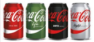
 Beyond your logo, you should be getting what are called “secondary graphics” (like the Coke “wave”) that can be used to bridge your current design with future expansions. Cheap logos will leave you, once again, throwing good money after bad as your brand finds itself in a territory uncharted by cheap design.
Your visual brand identity is a living, organic mechanism for embracing what your brand stands for, how it distinguishes itself from the competition, and how it will grow as your business grows. A cheap logo is never cheap. You will find yourself constantly spending additional money to solve the problems I’ve outlined here. And a good logo doesn’t have to cost a fortune either. So when it comes time to invest in a logo that reflects your hopes and dreams for your brand, spend both time and a little more money to get the logo you truly deserve. Cheap doesn’t pay.

Hi Vince,
Not just logo designing, this is applicable for almost all the designing fields at least, “”If you hire the D students, you’ll never get A+ results””.
I found this article so on point.