Everyone in marketing (and many more who are not) is comfortable discussing promotional tactics such as ads, online activities and TV commercials. We are exposed to these media every day, and there are columnists who critique and help us build our promotional literacy. Not so for discussions about logo selection. Very rarely do marketers get a chance to launch a brand identity; and since the brand has yet to debut and generate discussion in public, a logo presentation usually results in a brand team staring in silence, afraid to say anything that would make them feel diminished. Often, the dialogue devolves into what people “like” or “don’t like,” which would be fine if those preferences related to some strategic insight, and not just to someone’s preference for, say, purple, or their hatred of “swooshes.”
This is normal. Learning a vocabulary and grammar about logos is not unlike learning Spanish or Chinese. It requires a willingness to expand one’s horizons, educational opportunities and continued study. What follows are the top five best practices for learning about and discussing logos in a meaningful way. They don’t cover every situation, but they are enough to get you on your way to fluency. If you are part of a marketing team and are in the process of creating a brand identity or refreshing an existing identity, it might be a good idea to print this out and share it with your colleagues so that you are all, literally, on the same page.
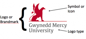
1. Know your logo anatomy. As with learning any foreign language, the first step is to understand what things are called. See the illustrations below.


The basic components of this logo (or brandmark, as designers call it) are two-fold: the brand name rendered in distinctive type, and a symbol or icon. Here the symbol (a stylized griffin) is representational. Often, the symbol is abstract, like a shape or a swoosh or some other graphic flourish. Taken together, this is also called a “lockup,” meaning that the exact, relative proportions of the elements are fixed. The upper illustration is called a vertical lockup, and is used when space is not an issue. The illustration beneath is called a horizontal lockup, and is used in vertically narrow spaces. (It is shown here in white on a black background. This version is called a “knockout” because it appears as though the white logo is a stencil–or knocked out of the black backdrop.)

The illustrations above show two other examples of brandmarks. The first uses a device called a Holding Shape, which is a defining geometric area in which the logo type resides. The second is called a Wordmark, which is simply the logo type. Other than over-design (logos that use too many elements all together), there is no right or wrong way to render a logo. A branding expert can help you find the proper logo elements for your brand.

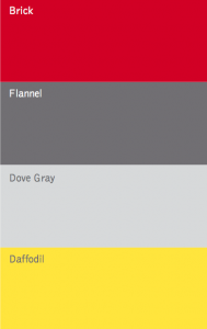
Above you can see another vital element: the color palette. This one is for Gwynedd Mercy University shown in the first example. The color palette, as the name suggests, features approved colors for marketers and designers to use when creating promotional tactics. Since names such as ‘red’ do not capture the many different shades of that color, I prefer to use more evocative color names so that they are easier to discuss. (There are also numerical formulas to duplicate the exact colors, but we don’t need to delve into that here.) To offer further guidance, there is often a primary palette (Brick and Flannel in this case), and a secondary palette (Dove Gray and Daffodil). Some brands have many colors in their palette (Google), while others use only one (Tiffany).
2. Use the branding strategy as your North Star. Decisions about type, color and icons are neither subjective nor accidental. They derive from a very specific branding strategy that has two components: the Brand Commitment—the promise the brand makes to customers; and The Brand Personality—the tone and style in which the promise gets delivered. For Gwynedd Mercy University, the Brand Commitment is “Discover your personal path to transformational success,” and the Brand Personality traits are Progressive, Confident and Engaging. The University chose the above logo because the school’s symbol, the Griffin, sits Confidently on a runway, poised to take off into its future (Progressive), a metaphor for the Brand Commitment. Red also evokes a Progressive tone, while Flannel is warm and Engaging. So when discussing logos, let the strategy be your guiding light so that your comments stay objective and true to the brand.
3. ABC (Always Be Constructive). Start out any critique with what you like. This keeps the conversation on an upbeat note so that it doesn’t become a Grinch session. By talking about what you don’t like, you are not helping yourself or anyone arrive at a useful direction. Ever been with a friend when you are trying to figure out where to go to dinner and they say, “Well, I don’t like Italian or French or Chinese food?” Big help, right? By starting out with what you like, others can join in your enthusiasm, and before you know it, you’ve picked a logo about which everyone is happy.
4. Presume wise intentions. Good designers know what they are doing, and they know more than you or me why they rendered a logo in one way versus another. Ask questions that help focus the designer and others on what your specific preferences or concerns are. “What’s your thinking about the relative sizes of the logo type and symbol?” or “What’s the reason behind not using Daffodil in the logo?” are good types of questions with which to start. The answers may prove very enlightening. (I’ve been doing this for decades and I continue to learn how to view the intention behind logos more clearly.)
5. Be part of the solution. If you are going to criticize an idea, always contribute a way to make it better. “I like the symbol in logo concept number three, but I’m not crazy about the logo type. Can you make the logo type more like you did in concept two?” Criticism alone carves you out of the process—makes you an observer, not a participant. Do your part in helping to birth a wonderful idea or improve on an existing one.
With your newly found fluency, you may not speak Logo often, but when you do, you’ll look and feel like a natural. And unlike French or German, you don’t have to worry about nailing the accent.
