Having loaded the newest operating system onto my iPhone 5, I—as many others—couldn’t help but notice all the changes. Did it make the phone faster? No. Did it make the phone more customer friendly? A big NO. Did it make it “easier” to do certain functions? Debatable. So what do we call change that doesn’t improve things? Ego.
My thesis is best illustrated with the icons to be found on the iPhone. For some reason, the “engineers” at Apple decided to change all of them. Yes, ALL of them. Surely this cannot mean that every single icon was failing to do its job, which is letting the user recognize a familiar symbol—a branding asset—so he/she can go about the task of, well, managing their own lives with minimal interference. I can see if Apple changed one or two because they had done research and learned it was causing a recognition problem. But no. They changed all of them, making the user adapt to their idea of change, which has nothing to do with improvement. That is, we are now forced to accommodate the phone rather than the phone accommodating us. Mr. Jobs is staring at us from the beyond with smoke coming out of his ears. (That would be a good icon.)
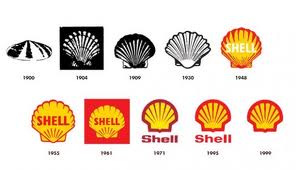
When it comes to advertising and promotion, change is essential. Fresh ideas transfuse lifeblood into the selling situation, keeping the buying public engaged week after week. But when it comes to branding, change is life threatening. The most creative act in branding is resisting change—putting the brand above one’s own personal agenda to “improve” things. I’m not saying that branding elements should never be changed. Rather, they should only be changed to address a problem, such as a serious decline in equity, or a desire to reflect additional equity for the brand as times change. Take the evolution of the Shell logo over a glacial period of time (see below). While adding color and stripping away some fat over the years, the brand managers took great care not to corrupt the hallmark’s central concept. This earned them the privilege of even eliminating the company name since the icon has absorbed so much meaning on its own that the icon and the brand are one and the same. Now go back and look at the new iPhone icons. Where the hell is the Newsstand app? They turned a shell into a goat.

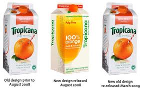
Apple is not the only company to let ego triumph over the brand. Back in 2008, PepsiCo learned an expensive lesson with its Tropicana brand of orange juice. (For those who don’t recall, see the branding hallmark changes below.)

The icon of an orange with a straw stuck in it was not only highly effective at signifying “freshly squeezed,” it also telegraphed the packaging to loyal customers despite other brands appropriating Tropicana’s orange and green color palette. As with the Apple icons, people didn’t recognize the Tropicana cartons and had to search for their favorite brand. And once they found it, they reacted as if they found themselves in The Invasion of the Body Snatchers: this is not my brand; this is a fake. Tropicana sales dropped 20%…in one month! Did PepsiCo do any research to see if the old branding hallmarks had lost their equity with customers? No. Were they fixing a “problem?” No. Then what where they thinking? Ego.
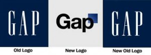
Only three years ago (2010), the department store brand, The Gap, made a similar, unaccountable blunder. (Again, see below for the history)

They decided to replace their 20-year brandmark with an updated version that retained the blue box, but moved it up and to the right side of the ‘P’. The stated intention was articulated in The Huffington Post by Marka Hansen, president of Gap North America: “We want our customers to take notice of Gap and see what it stands for today,” she said. “We chose this design as it’s more contemporary and current. It honors our heritage through the blue box while still taking it forward.” OK, so they did insight research and determined that customers were tired of the old brandmark and would like to see a new one. Nope. In fact, customer protests were so voluminous–aided by the viral power of the internet–that a virtual boycott of the brand was threatened. What problem were they fixing, then? One theory was that Gap’s stock price had been dropping as much as 13%. Change the logo to boost the stock price? This makes about as much sense as changing the American flag because our reputation overseas may have gone down.
Brand managers who meddle with a logo should know that they are playing too close to the third rail. If they are not careful, they could injure or kill the very brand under their guardianship. Always do some basic branding research (not advertising research) to learn if your branding hallmarks represent the values customers esteem. If not, find out what values are under recognized and adjust accordingly. If so, leave it the hell alone. You will be doing your brand—and your career—a favor. Resisting change is a brave act in our perpetually morphing society. So if any Apple brand managers are listening, here’s a priceless piece of advice: just because you have the power to change something doesn’t mean your are making it better. Now where is that Safari app?

It totally irritates me when a company changes something for no purpose but to change it. Yahoo changes their site to try to make it look more like Google, but in doing so the user becomes totally lost as to where their previously familiar buttons and various links have gone. Facebook does the same thing with regularity. One day we know how to use it, the next day we have to learn it all over again. I hate that.
Gary,
Somehow, brands like Facebook and Yahoo have gotten the relationship all mixed up. Instead of caring about their customers and sourcing feedback about how better to engage them in the brand experience, they seem to have this attitude: we know what’s best for you, so shut up and follow. This will eventually hurt them badly as it leaves a need in the market unmet, and others will flock to fill it.
Or perhaps I give them too much credit. As my blog post argues, maybe they just change things because they get bored easily. It’s the difference between maturely running a business, and playing at running a business.
Thanks for your comment.
Best,
Vince Parry
Parry Branding Group
President & Chief Branding Officer
718-753-4514
vparry@parrybranding.com
parrybrandinggroup.com
Wonderful write-up… Your perspective is refreshing.
Will share this with others
Thanks so much. I wrote this twelve years ago (yikes!), and I find the observations still ring true for the most part. One big exception is the availability of Open AI, specifically in the form of Chat GPT and its siblings. While AI has certainly made it easier to generate narratives, visuals and other wonders, it can’t think yet–just cut and paste content from the internet. I, for one, are happy about this. We’re getting way too comfortable outsourcing our intellect to technology. Again, technology should serve us, not think for us or make it hard to retain our unique voices. Anyway, happy you found my blog insightful. Best, Vince Parry.