
Color is the Rodney Dangerfield of branding hallmarks. Compared to typography and iconography, it gets little to no respect in the development of healthcare brands. Yet it is the first aspect the eye sees when searching. True, some healthcare marketers honor the role that colors play in brand building. But they are the exception rather than the rule. When it comes to a brand’s color palette, what consumer marketers study and exploit with great care, healthcare marketers make only a token effort, one usually uninformed by the thousands of pages that have been written on color psychology. Why is that?
In all fairness, many of these pages are goofy takes on the subject, doling out blatantly obvious observations that red is the color of passion or purple the color of royalty. It’s not so much that this is untrue, but rather that such reductivism isn’t helpful or insightful. There is no red or purple; there are thousands of reds and purples…and other hues, of course. Just take a tour of the swatches at a Benjamin Moore store and you’ll get dizzy from all the options.
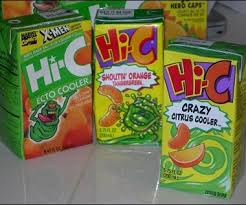
However, even considering the bad press out there, many healthcare marketers—and worse, their agency creatives—often try to come up with their own theory about color as if previous science on the subject hasn’t existed for decades. In a recent analysis of healthcare branding, I asked the art director of an ad agency how she came up with the color palette for an antiviral vaccine. She said, “I took all the colors that the competition uses, eliminated them, and then chose from what was left over.” (She is not alone in applying this “process.”) The logotype was a bright orange, and the icon was rendered in lime green. Instead of a serious medicine, the brand looked like a Hi-C juice box.
And who can read orange type when it reduces? Imagine if a restaurant chef selected his/her menu items using this same approach—eliminating what everyone else was serving and then selecting from what was left over. Pancreas tartare. Squirrel chowder. Fricassee of hen wattle (ok, this last one may be a French delicacy, but still).
While this blog will eschew a century of learning on color psychology and color theory (go read Pantone Guide to Communicating with Color, people!), here are the top five guidelines for honoring the role that color plays in branding.
- Color is informed by the branding strategy, not someone’s spouse. Tiffany, the retail brand, doesn’t use its distinctive Robin’s-egg blue just because no one else does. It’s intended to convey what color psychology has established as the following personality traits: elegant, hopeful, pure and precious.
 Over the years, as the brand experience gained momentum like a snowball down a mountain, the color grew to mean luxurious and uncompromising as well. These are objective truths that can often elude healthcare marketers and their agencies. Never accept a color recommendation for your brand if it isn’t objective (i.e. if it’s what the brand manager’s wife likes).
 - Color in branding should be branded. Stop using generic terms like Yellow or Green when evaluating color options. It dumbs down the dialogue and over-simplifies the complexity involved in selecting the right colors for your brand. Instead of presenting the branding colors for Propecia (finasteride), a hair-loss therapeutic identity on which I worked, as gray and blue-green, we proposed Flannel and Caribbean. This was inspired by the branding strategy: a treatment for men that’s as professional as a gray flannel suit; and as serene and tranquil as a Caribbean pool.
 If this seems silly to you, consider this: one of the colors we proposed for the anti-depressant, Effexor, was an uplifting Yellow. The brand director responded: “Yellow is the color of fear; and we cannot base our brand strategy on fear.” We came back and presented the same color a week later, only this time branded it as Marigold. “That’s much, much better,” said the same brand director. Still have doubts? Which lipstick do you believe will sell better: Dark Red or Vampire State Building?
 - There is no “I” in color. While my first two guidelines discussed single colors for the sake of making my respective points, brand color is rarely a single color, and more of a proprietary set of colors. (Nexium, the “purple pill” is a noted example. Ironically, it is a capsule, and not a pill.)
 This is called a color palette. In addition to having the primary colors that evoke the personality traits of the brand strategy, secondary or accent colors help customize how the brand appears on a surface (online, in print, on packaging, etc.), and can make the primary colors more expressive. The reason? When juxtaposing colors, we see the individual colors differently than if they were isolated. Take a look at the illustration below.

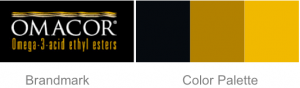
Against the black background Red pops more than it does when underlain with white. The red square also seems larger than it does on black than on the other color backgrounds. Surmounted over orange, and creating a low-contrast combination, Red appears anemic. But Red glows like a hot coal over turquoise. So avoid the conversational trap of “the competition owns blue” and come back with: “the competition uses a Windex Blue always in combination with Candy-Apple Red; we own Indigo and Lamborghini Yellow.” - Black and white are colors, too. And so are the 50 shades of gray in between. According to Forbes Magazine, the top three best-selling colors for new cars are White, Black and Silver (sort of gray). Yet they get overlooked in healthcare. How many black healthcare brands can you recall? I know, I know. Black is the color of death, and we cannot have death as a brand strategy. But black is also the color of women’s favorite little dress and tuxedoes. And when paired with the right secondary color(s), black can be classic, sleek and sophisticated, as rendered here in the Omacor identity (which my firm didn’t do).
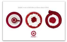
 The same goes for white. Look at how white and red make each other irresistibly watchable in this identity for Target.
If black and white scare you too much, then seek the refined presence of the grays. When you see gray alone, you may get “dull, drab, dispassion.” But again, combine a soft Dove or Gotham Gray with Red or even Yellow, and the results are Authoritative, Inspiring and Stately, as in this identity for Gwynedd Mercy University (which my firm did do).


- There is such a thing as too many colors. While there is no hard, fast rule on how many colors are too many, let common sense be your guide. Many colors hold the risk of making the palette difficult to manage when different vendors try to apply the brand guidelines, thereby threatening the integrity of the brand’s proprietary appearance. Further, many colors could prove to be a production nightmare trying to match the exact color formulas in different venues. However, if one wishes to own a multi-colored palette, then one must commit to truly owning it, just as the fashion designer, Paul Smith, has done so memorably.

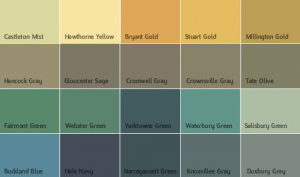
If you feel that a two- or three-color palette may limit the display of your brand’s personality, then don’t add another color; add different densities (or shades) of the existing colors, as shown below.
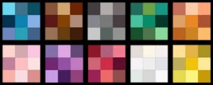
Each color in the palette may have two or more related shades that keep color on strategy and cohesive, yet offer flexibility when creating well branded materials.
And speaking of using common sense, avoid the embarrassment of “yellow is the color of fear” comments I’ve mentioned above. Colors do not have absolute values, but rather a host of nuances. Concerns that Red means stop, so people will quit reading; or sanitation uniforms are Green, so people will think the brand is garbage; or Yellow connotes cowardice; or Purple equates your brand with Barney the Dinosaur. This takes a rich, fruitful exploration of how color can differentiate and deliver on the brand strategy, and reduces it to the lowest denominator of human perception. And that just makes me Blue.
Great points.
And I’ll add that a well-conceived color palette is worth it’s weight in gold ( real gold, not just the color) because it effectively transfers its equity from traditional applications to the display of information — in this age of data visualization color offers a simply and powerful way for a brand to brand its data.
cheers